

Project description
I worked with my client, a Child and Adolescent Psychotherapist, to create a full brand identity for her private practice, including collaboratively developing the name Psycle. The name is a play on the word “cycle,” symbolizing the continuous process of growth, healing, and self-discovery in therapy. The goal was to design a visual language and digital presence that felt warm, trustworthy, and modern, connecting with both young people and adults in a welcoming and professional way.
Timeline
A 6-week process covering discovery, brand development, website planning, and full visual execution
Background
Selin was launching her private practice and needed a cohesive brand that reflected her values: openness, trust, growth, and human connection. The design needed to strike a balance—professional but approachable, modern yet calming, appealing to both teenagers and adults.
We collaborated closely on moodboards, style direction, tone of voice, and visual personality. A special emphasis was placed on avoiding clichés (like overly clinical or overly “zen” aesthetics) and instead crafting a look that feels grounded, gentle, and clear.
Research & Discovery
Explored references and conducted a collaborative style direction session
Created moodboards to define the tone: authentic, supportive, modern, and clean.
Analyzed competitors in the mental health space for differentiation
Brand Identity Development
Designed a flexible logo system
Defined typography, color palette, and visual elements
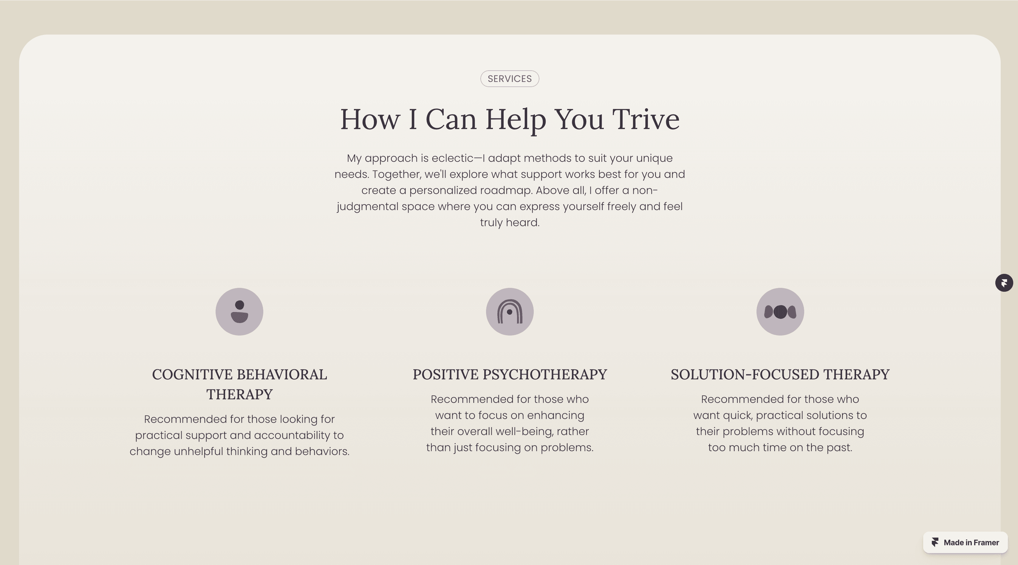
Website Design
Mapped key user flows and content strategy for a clear, calm website experience
Designed and built a responsive Framer website aligned with brand identity
Included sections for services, about, process, pricing, and FAQ
Logo & Visual Identity
A simple yet meaningful symbol paired with soft typography and a balanced palette.
Color Palette
A deep indigo and soft purple serve as the core brand colors evoking calm, introspection, and trust set against a warm beige background that adds comfort and openness to the overall tone.
Website in Framer
A fully responsive website built in Framer, designed to guide visitors through services, approach, and booking steps with clarity. The layout prioritizes soft transitions, clean spacing, and inviting content structure that resonates with both teens and adults.
Tone of Voice
Gentle, clear, and supportive, written to make clients feel seen and safe, without being overly clinical or abstract.


Human-Centered Brand System
A cohesive identity that reflects warmth, trust, and clarity, designed to resonate with both teens and adults across all touchpoints.
Meaningful Naming & Visual Language
The name Psycle and the soft visual palette work together to represent therapy as a continuous, supportive journey
Tailored Website Experience
Built in Framer, the responsive website guides users with intuitive structure, calm design, and accessible language.
Client-Aligned Outcome
Selin shared that the brand "feels like her", capturing her values, therapeutic approach, and professional growth path.